 Thoughts:
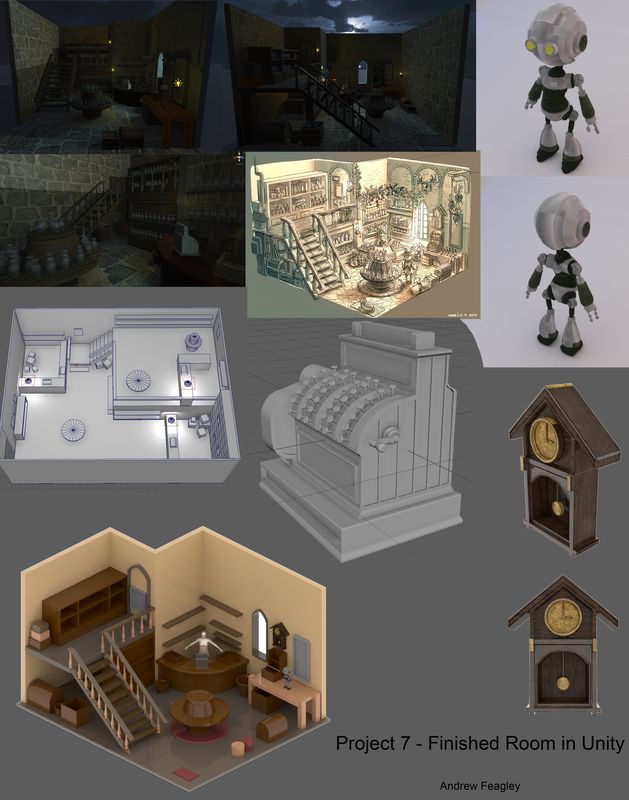
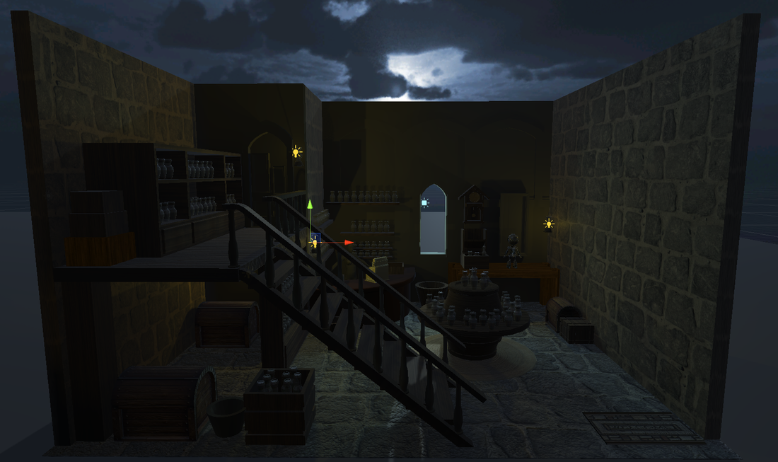
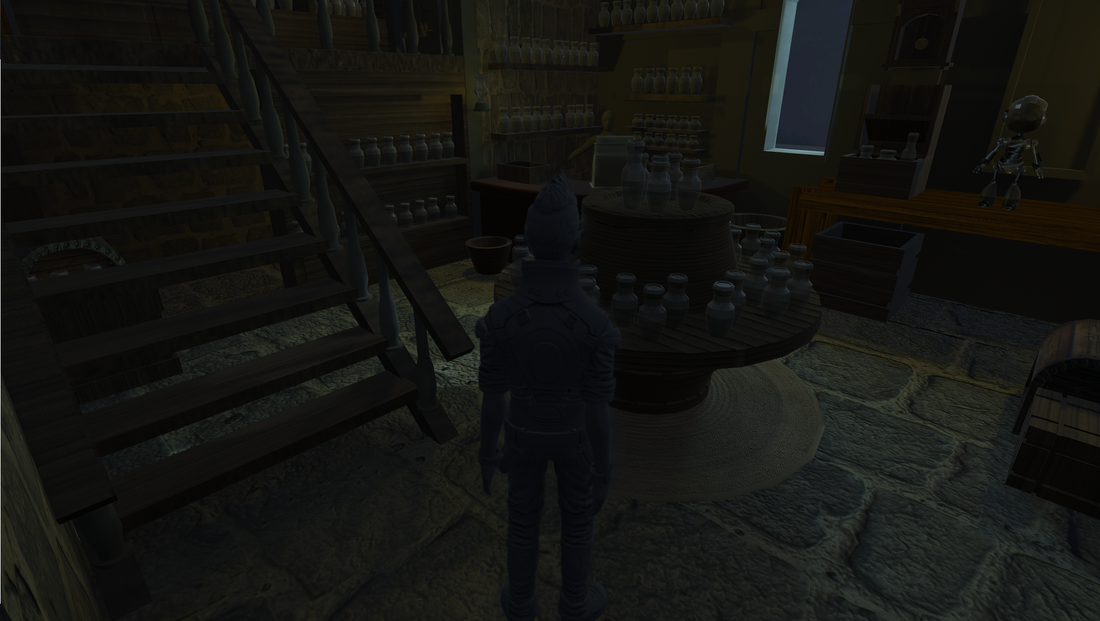
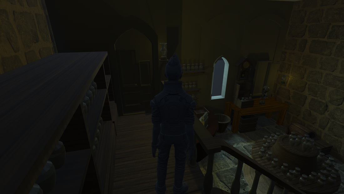
Importing the assets into Unity wasn't very difficult, I'd used Unity before and I was used to importing assets into it. Setting up the scene didn't take too long, what took a long time was setting up the materials for each object in the scene. For some reason Unity thought that every object had some sort of UV problem, usually overlapping UVs. I wasn't sure why it kept giving me the warning, even when I imported a cube from Maya with no alterations it still gave the warning. I had never really used the Lightmap settings in Unity before but they weren't too complicated. What surprised me was just how long it took to bake the lightmaps. It seemed to range from ten seconds with a minor change to the scene to almost ten minutes with larger changes. I didn't make a roof for my scene in Maya so I wound up using a cube I made in Unity to block the directional light from coming in through the roof. I think doing that made the room look a little nicer. I'm somewhat happy with how the scene turned out but I wanted a scene that took place in the early morning, but I couldn't find a good skybox texture. I settled for having it take place at night, with a bright moon and some warm looking lanterns in the room. The room could definitely look better but I think for a first attempt at creating a 3D scene using my own assets it turned out alright.
0 Comments
 Thoughts:
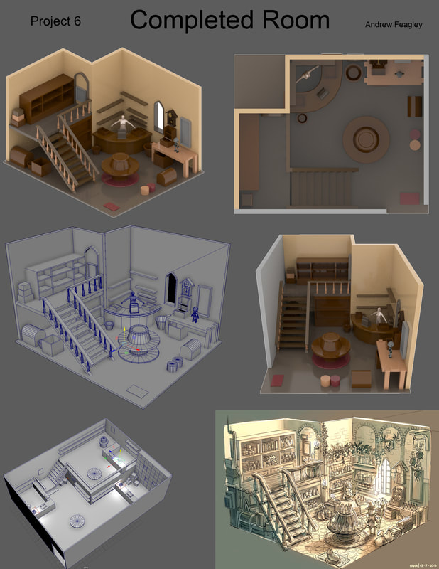
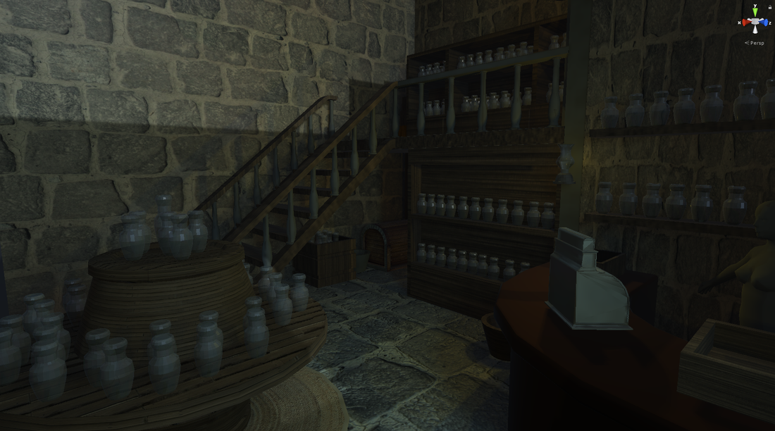
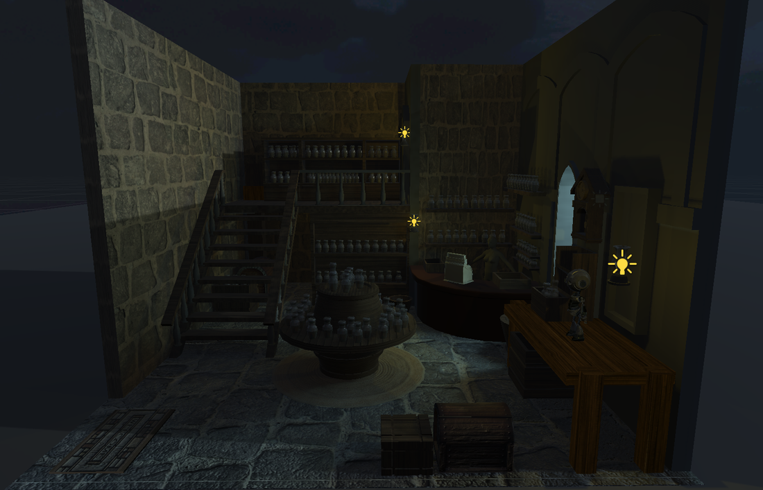
I am fairly happy with how the room turned out. You can see the original graybox in the bottom left hand corner of the image above and in comparison the new room looks much better. The new room is much closer to the reference image I used in both layout and scale. The reference image doesn't use realistic humans in it so it was somewhat difficult to accurately scale everything, even with the Maya default human in the scene. I didn't realize just how long it would take me to model and texture everything in the scene and I ran out of time. That's why the final renders use mostly basic vertex colors. I realized after I had finished modeling everything that the reference didn't have a door to model and so the entry to the room is just an open hole. The scene is also missing many of the little nick-knacks and potions that the reference image has. I didn't have enough time to model and texture potion vials and books and parcels. There are also decorations and architectural touches that are missing from the final model, the arches and the plants didn't seem important enough to model. I'd like to continue polishing and fixing up this model. I think it would be good practice. 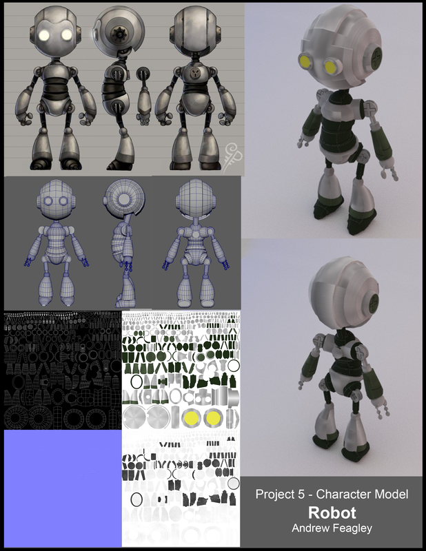 Thoughts:
I started this project by trying to model a witch. I had hoped that it would look good in the potion shop that I had been modeling throughout the year but unfortunately I encountered some stumbling blocks. I found that I had a hard time getting the face of the witch right and I wasn't sure how to model her clothing properly. I decided instead to model a character that I thought would be a little simpler: a robot. I found a good reference image of a simple robot and got to work. The robot was much easier to work with, a good portion of its body was made up of simple shapes with very minor protrusions and bumps. I ran into another problem while texturing it: I couldn't find a good metal texture that I could easily wrap around the models curves. There is a noticeably seam on the robot's head (and several less noticeable ones on its legs) where the texture doesn't blend properly. The Specular map was, for once, not the biggest pain for me, instead it was the base texture colors. Getting the metal to look right on the 3D model was very difficult. The character was mostly smooth so there wasn't much to do with regards to the normal map. I tried to get the eyes to light up a bit in the render but the Arnold Renderer didn't seem to want to work for me. I'm overall happy with how the render turned out but I think it could have been a bit better. I'm going to try my hand at doing the witch again in the future. Textured Barrel Table 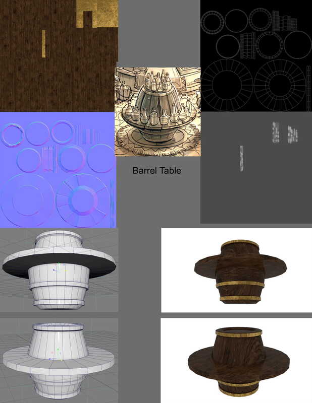 Textured Wall Clock 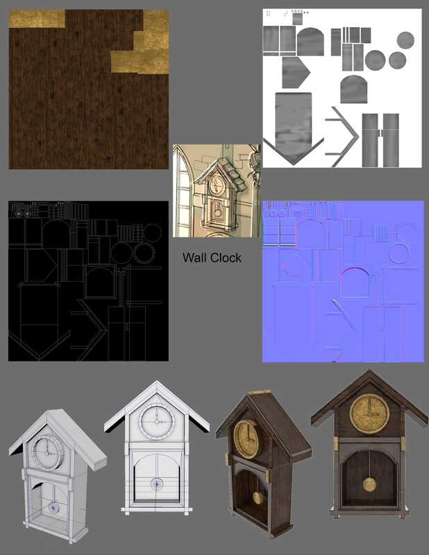 Thoughts
I am somewhat happy with how these two models turned out, more so with the clock than with the barrel. The barrel turned out alright, but the normals didn't map very well from the high poly to the low poly. The texture I chose for it looks fine on the barrel's center body but I think it doesn't look as good on the table portion. I might change the table to be made up of multiple planks of wood instead of just a single piece of wood in the future. I think that would make the table look a little more interesting. The barrel was very easy to model and I think I could have done more with it than I did. It turned out alright but it could be better. The clock is better than the barrel, I feel, the brass and wood textures show much better on it than they do on the barrel. The brass especially looks nice on the pendulum and as caps on the front of the clock. I may change the face of the clock at some point to something different from brass. The brass looks okay but maybe a different material would look even better. Creating the model itself was easier than the cash register but more difficult than the barrel table. It wasn't very challenging and I think I could have chosen a more difficult object, but I'm happy with how it came out. Incorrectly Textured Low Poly Cash Register 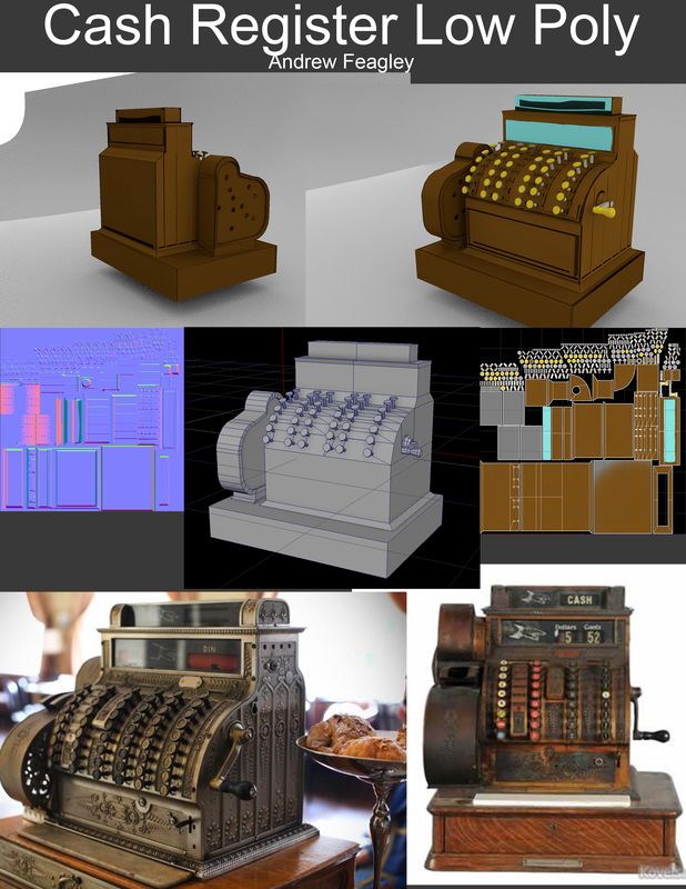 Thoughts
This project was frustrating for me, the shape of my high poly cash register mean that baking the normals from it onto my low poly mesh didn't work properly. You can see some weirdly shaped normals at the top of the model in this picture, I could not for the life of me figure out how to fix them. Baking the normals wasn't the only problem, Getting the textures in proved to be a challenge. I'm not sure entirely what the problem was but I could not get the wood and brass textures I wanted to show up properly in my render. I had to settle for a material that I painted in Maya, it doesn't look that great. I think I'm going to go back and redo this project at some point and fix the normals and get the textures working so the model looks nicer. I'm happy with how some of the normals came out, mostly the ones on the side of the model, the little ridges show up nicely and give some depth and detail to the otherwise barren side panels. I'm not sure how to make transparent textures on in Maya, I would have liked to have the panel at the top of the cash register slightly transparent so you could see through like it was made of glass. Old Fashioned Cash Register 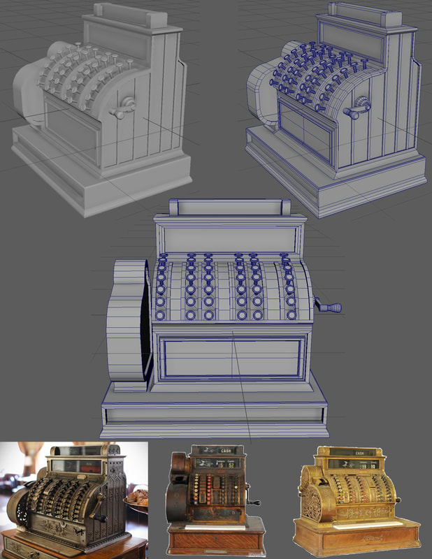 Thoughts
For this project I wanted to try and model something that I thought would benefit from having a bunch of polygons but that wasn't so complex that I couldn't make it. I think this cash register was about right for what I wanted to do, the basic shape is pretty simple, just a couple boxes on top of one another, each with some bevels at certain corners. The problem I faced was how to do the keys and the ridges on the curved face that separated them. Modeling a single wasn't difficult but placing them all individually was a chore. We learned how to duplicate objects along a curve in class the next day so I know how to make keys and other objects like this now. The ridges between the keys were a pain, especially where they ended at the top of the curve they followed. The details on the sides were just simple rectangles booleaned on, the handle was also modeled and then booleaned to the side. The receipt printer on the side was just a few cylinders booleaned together. This model wasn't too difficult but I did struggle with parts of it. Reference Image: Potion Shop by anacathie 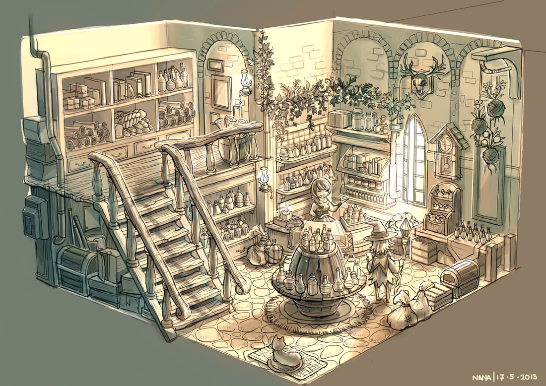 Graybox I didn't want to recreate the reference image above completely, I only wanted to take inspiration from it. 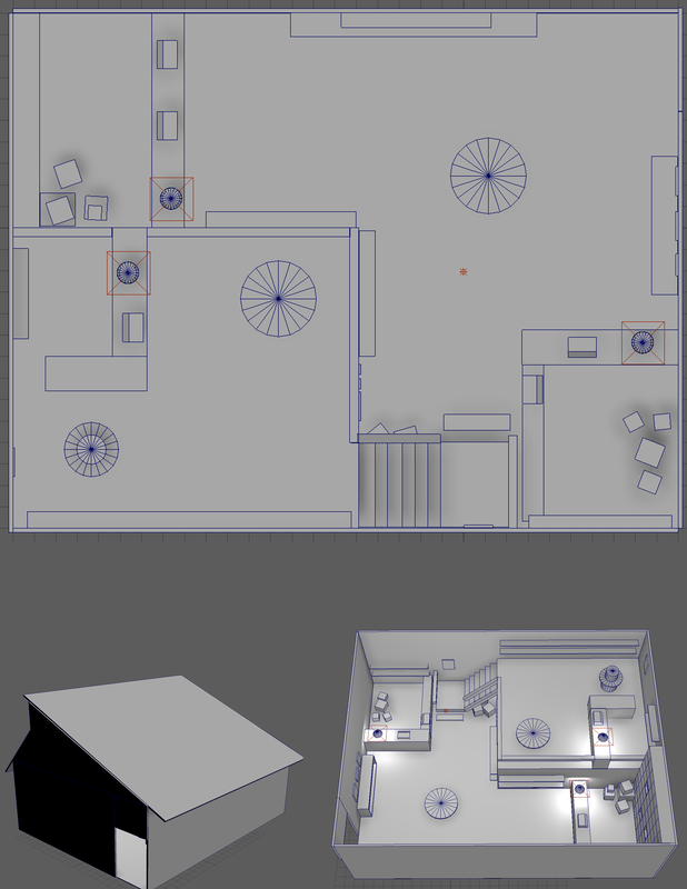 Thoughts
I think I have a fairly good understanding of what we've covered in class and what we've read in the articles so far. The basics in Maya are pretty similar to other 3D software I've used in the past so moving and transforming objects are pretty easy. I understand most of the concepts (grouping, parenting, booleans) I just have to remember where all the menus and settings are. I still have to check back on the articles to find things that are hidden away in menus (like the ambient occlusion setting) but if I practice enough I probably won't have to refer back to the articles as much. The links to the videos are helpful, seeing something done in real time as opposed to just static images with words under them is much more helpful. I was able to make my graybox fairly easily, it felt a lot like greyboxing a level in Unity or Unreal. I found that snapping objects was a little different and I would often snap things incorrectly and have to undo the move and move it without snap. Other than that, I didn’t really have any issues using Maya to make my graybox. |
Thoughts
This is where my reflections on the projects I did for my Computer Animation Modeling Class go. ArchivesCategories |
 RSS Feed
